

Live3 · Interface guide
Map
A geographic overview of your fleet: every station your organization can see, plotted on a map and coloured by health.
A geographic overview of your fleet: every station your organization can see, plotted on a map and coloured by health.
How to get there. Choose Map in the left navigation.
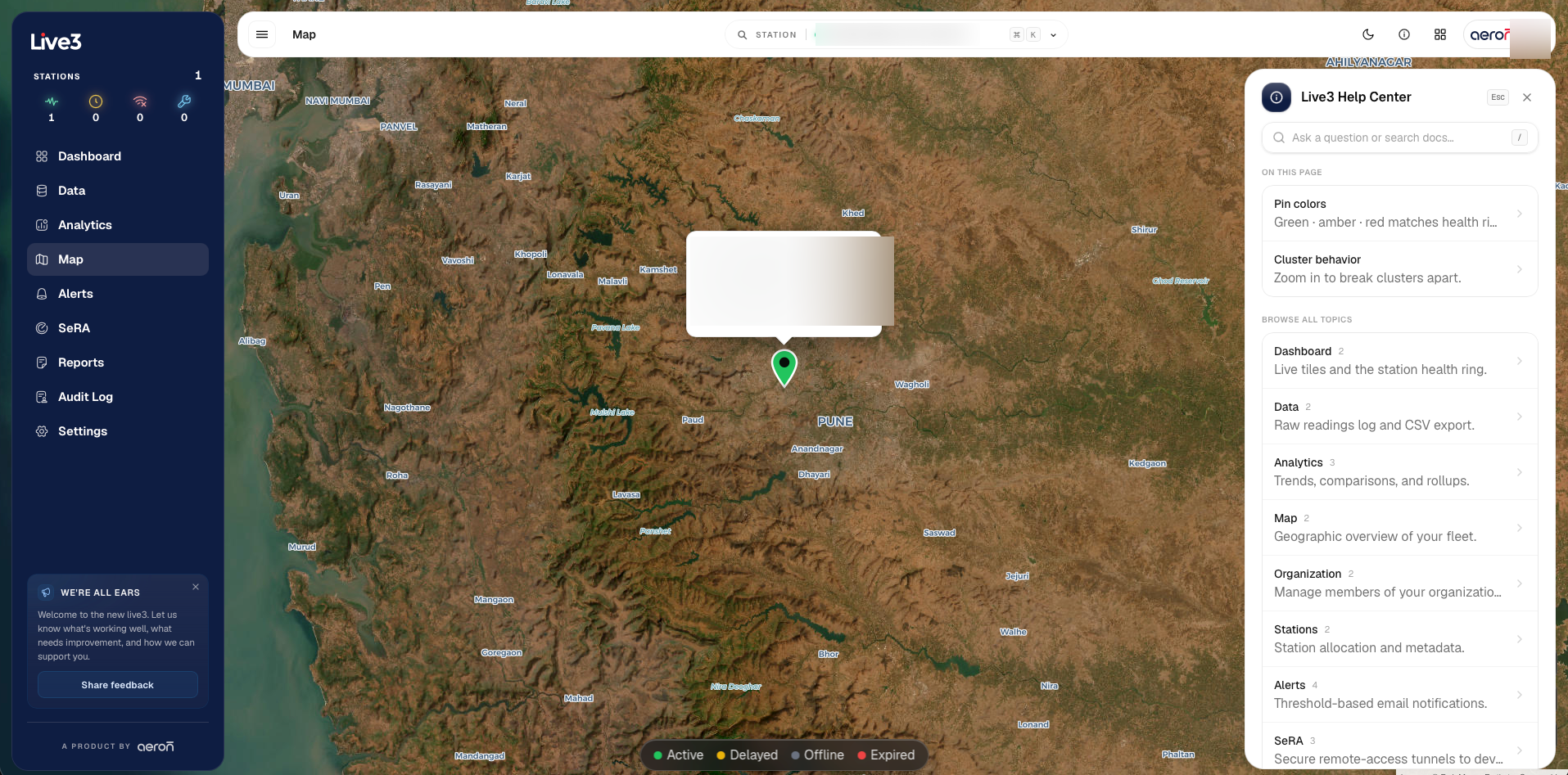
Key areas
| # | Area | What it does |
|---|---|---|
| 1 | Map canvas | Pan and zoom; each pin is a station. |
| 2 | Pin colour | Green, amber or red, matching the station health. The legend covers active, delayed, offline and expired. |
| 3 | Station popup | Click a pin for its status, owner and last-data time. |
| 4 | Clustering | Nearby stations group together; zoom in to break a cluster apart. |
Related
- Interface guide — every screen in one place
- How-to guides — tasks that span screens